Skip to contentList of 60+ Colours Names in English with colour example
| SN | Names of colours | Example |
|---|
| 1 | Amber |  |
| 2 | Aqua | |
| 3 | Arctic Blue | |
| 4 | Ash | |
| 5 | Azure | |
| 6 | Beige | |
| 7 | Black | |
| 8 | Blue | |
| 9 | Bronze | |
| 10 | Brown | |
| 11 | Brunette | |
| 12 | Burgundy | |
| 13 | Charcoal | |
| 14 | Coffee Brown | |
| 15 | Coral | |
| 16 | Cream | |
| 17 | Crimson | |
| 18 | Cyan | |
| 19 | Dark Green | |
| 20 | Emerald | |
| 21 | Fuchsia | |
| 22 | Garnet | |
| 23 | Grapevine | |
| 24 | Gray | |
| 25 | Green | |
| 26 | Indigo | |
| 27 | Ivory | |
| 28 | Jet black | |
| 29 | Lavender | |
| 30 | Lemon Yellow | |
| 31 | Lilac | |
| 32 | Lime Green | |
| 33 | Magenta | |
| 34 | Maroon | |
| 35 | Mauve | |
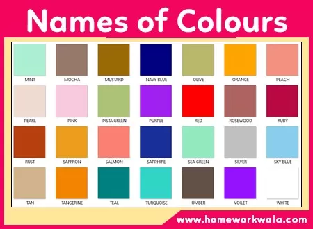
| 36 | Mint | |
| 37 | Mocha | |
| 38 | Mustard | |
| 39 | Navy Blue | |
| 40 | Olive | |
| 41 | Orange | |
| 42 | Peach | |
| 43 | Pearl | |
| 44 | Pink | |
| 45 | Pista Green | |
| 46 | Purple | |
| 47 | Red | |
| 48 | Rosewood | |
| 49 | Ruby | |
| 50 | Rust | |
| 51 | Saffron | |
| 52 | Salmon | |
| 53 | Sapphire | |
| 54 | Sea Green | |
| 55 | Silver | |
| 56 | Tan | |
| 57 | Tangerine | |
| 58 | Teal | |
| 59 | Turquoise | |
| 60 | Umber | |
| 61 | Violet | |
| 62 | Cherry Red | |
| 63 | White | |
| 64 | Yellow | |