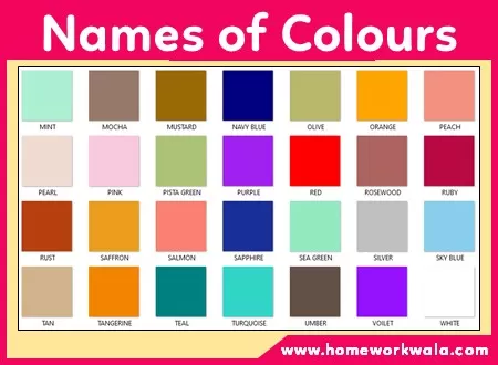
This article explores the fascinating world of colors and their names in the English language. From the basic primary colors to the more complex shades and hues, this comprehensive guide covers it all. Students can learn about the origins and meanings behind each color name, as well as their cultural significance and symbolism. They can also discover interesting facts and trivia about colors, such as which colors are considered lucky or unlucky in different cultures. Whether you’re an art student, a language learner, or simply curious about the world of colors, this article is a must-read.
About Colours Name
An article about the names of colours in English can be a helpful resource for students who want to improve their vocabulary and understanding of different colours. The article could provide an overview of the most commonly used colour names, along with their meanings, shades, and variations. It could also include examples of how to use these colour names in sentences and discuss the cultural significance of certain colours in different contexts. Additionally, the article could include tips on how to remember and differentiate between similar colour names, such as magenta and fuchsia. Overall, an article about the names of colours in English can be a useful tool for students looking to expand their knowledge of the language and improve their communication skills.
List of 60+ Colours Names in English with colour example
SN | Names of colours | Example |
---|---|---|
1 | Amber | |
2 | Aqua | |
3 | Arctic Blue | |
4 | Ash | |
5 | Azure | |
6 | Beige | |
7 | Black | |
8 | Blue | |
9 | Bronze | |
10 | Brown | |
11 | Brunette | |
12 | Burgundy | |
13 | Charcoal | |
14 | Coffee Brown | |
15 | Coral | |
16 | Cream | |
17 | Crimson | |
18 | Cyan | |
19 | Dark Green | |
20 | Emerald | |
21 | Fuchsia | |
22 | Garnet | |
23 | Grapevine | |
24 | Gray | |
25 | Green | |
26 | Indigo | |
27 | Ivory | |
28 | Jet black | |
29 | Lavender | |
30 | Lemon Yellow | |
31 | Lilac | |
32 | Lime Green | |
33 | Magenta | |
34 | Maroon | |
35 | Mauve | |
36 | Mint | |
37 | Mocha | |
38 | Mustard | |
39 | Navy Blue | |
40 | Olive | |
41 | Orange | |
42 | Peach | |
43 | Pearl | |
44 | Pink | |
45 | Pista Green | |
46 | Purple | |
47 | Red | |
48 | Rosewood | |
49 | Ruby | |
50 | Rust | |
51 | Saffron | |
52 | Salmon | |
53 | Sapphire | |
54 | Sea Green | |
55 | Silver | |
56 | Tan | |
57 | Tangerine | |
58 | Teal | |
59 | Turquoise | |
60 | Umber | |
61 | Violet | |
62 | Cherry Red | |
63 | White | |
64 | Yellow |
Colours name and their meanings
Amber colour
Amber is a warm and glowing shade of yellow-orange that is similar to the color of fossilized tree resin. It is a rich and inviting color that is typically associated with nature, warmth, and a sense of antiquity. Amber has a wavelength of roughly 590 to 620 nanometers.
In terms of its appearance, amber is a deep and radiant color, often described as golden-yellow with hints of orange or brown. Some common objects or things that may be associated with the color amber include certain types of gemstones, like amber or topaz, as well as certain types of furniture or decor, like wooden carvings or antique lamps. Amber is also a popular color in art and photography, as it can create a warm and nostalgic atmosphere.
Aqua colour
Aqua is a color that is typically associated with tranquility, freshness, and purity. It is a light shade of blue-green that is similar to the color of tropical ocean waters. Aqua has a wavelength of roughly 490 to 520 nanometers.
In terms of its appearance, aqua is a soft and soothing color, often described as a pale or pastel blue-green or turquoise. Some common objects or things that may be associated with the color aqua include certain types of marine life, like tropical fish or coral reefs, as well as certain types of gemstones, like aquamarine or turquoise. Aqua is also a popular color in fashion and home decor, as it can create a calming and refreshing atmosphere.
Arctic Blue colour
Arctic blue is a pale, icy blue color that is reminiscent of the frozen Arctic Sea. It is a cool and calming color, often associated with the tranquility of winter landscapes.
Ash colour
Ash is a pale gray color with a slight green or blue tint. It is named after the residue of burned wood or other material. Ash color can also refer to a range of similar colors, including light grays, silver, and off-white shades with a cool undertone.
Azure colour
Azure is a bright and vivid shade of blue that is often described as resembling the color of the sky on a clear day. It is a light and refreshing color that has a cool, calming effect and is often associated with clarity, harmony, and tranquility.
In design and fashion, azure is a popular color for summer clothing and beachwear, as well as for home decor and accessories such as throw pillows and bedding. It can be paired with other pastel colors like pale pink and soft yellow for a delicate and feminine look, or with deeper blues and greens for a more vibrant and energetic effect.
Symbolically, azure is associated with peace, serenity, and creativity. It is sometimes used to represent the throat chakra in yoga and meditation and is believed to promote communication and self-expression. In art and literature, azure is often used to evoke feelings of optimism and hopefulness, and is used to describe the endless expanse of the open sky or the deep blue sea.
Beige colour
Beige is a colour that is typically associated with neutrality, simplicity, and warmth. It is a light brown colour that is similar to the colour of natural wool or sand. Beige has a wavelength of roughly 580 to 620 nanometers.
In terms of its appearance, beige is a muted and subtle colour, often described as a pale shade of brown or cream. Some common objects or things that may be associated with the colour beige include certain types of fabrics, like linen or cotton, as well as certain types of interior design elements, like wall paint or furniture. Beige is also a popular colour in fashion, as it can create a classic and timeless look.
Black colour
Black is a color that is typically associated with sophistication, elegance, and power. It is the absence of color and is created when all colors are absorbed, and no light is reflected back to the eye. Black has a wavelength of roughly 700 to 400 nanometers and is often described as a neutral or achromatic color.
In terms of its appearance, black is a very dark color and is often used as a background or base color to make other colors stand out. Some common objects or things that may be associated with the color black include tuxedos, evening gowns, black cats, and the night sky.
Blue colour
Blue is a color that is typically associated with calmness, serenity, and intelligence. It is a primary color, meaning that it cannot be created by mixing other colors together. Blue has a wavelength of roughly 450 to 495 nanometers and is often described as a cool color.
In terms of its appearance, blue can come in many different shades and tones, ranging from bright, sky-blues to deeper, navy-blues. Some common objects or things that may be associated with the color blue include the ocean, the sky, blueberries, and the United Nations flag.
Bronze colour
Bronze is a metallic shade of brownish-orange color that is created by combining copper and tin. It is a lustrous and versatile color that is often associated with strength, durability, and antiquity. Bronze has a wavelength of roughly 570 to 590 nanometers.
In terms of its appearance, bronze is a warm and rich shade of brownish-orange that can have a metallic sheen or patina. It is a popular color for sculptures, medals, and other metal objects that are designed to convey a sense of tradition or history. Bronze can also be used in fashion and interior design, as it can create a sense of warmth and richness. Some common objects or things that may be associated with the color bronze include the Statue of Liberty, Olympic medals, and certain types of hardware and fixtures. Bronze can be paired with a range of other colors, including white, black, earthy greens, and blues, to create a balanced and harmonious color scheme.
Brown colour
Brown is a color that is typically associated with earthiness, warmth, and stability. It is created by mixing different amounts of red, yellow, and black together. Brown has a wavelength of roughly 590 to 620 nanometers and is often described as a warm color.
In terms of its appearance, brown can come in many different shades and tones, ranging from light, beige browns to dark, chocolate browns. Some common objects or things that may be associated with the color brown include tree trunks, soil, leather, and coffee.
Brunette colour
“brunette” typically refers to a person with brown hair, rather than a specific color. However, in the context of color, “brunette” could be interpreted as a darker, brownish shade of hair or a brownish color with a hint of red or gold.
Burgundy colour
Burgundy is a deep, rich shade of red that is named after the wine produced in the Burgundy region of France. It is a sophisticated and elegant color that is often associated with luxury, richness, and refinement. Burgundy has a wavelength of roughly 620 to 740 nanometers.
In terms of its appearance, burgundy is a deep and dark shade of red that can sometimes appear brownish or purplish. It is a versatile color that can be used in a variety of contexts, including fashion, interior design, and graphic design. Some common objects or things that may be associated with the color burgundy include wine bottles, leather jackets, and velvet fabrics. Burgundy is a popular color for formal occasions, as it can create a sense of opulence and glamour.
Charcoal colour
Charcoal is a dark, muted shade of gray that is named after the material used to create drawings and sketches. It is a versatile color that is often associated with sophistication, elegance, and formality. Charcoal has a wavelength of roughly 400 to 500 nanometers.
In terms of its appearance, charcoal is a deep and rich shade of gray that can sometimes have a slightly blue or brown undertone. It is a popular color for fashion and interior design, as it can create a sense of drama and contrast. Some common objects or things that may be associated with the color charcoal include charcoal drawings, business suits, and certain types of furniture. Charcoal can also be used as an accent color to add depth and contrast to a design or outfit.
Coffee Brown colour
Coffee brown is a rich, warm shade of brown, similar in color to a freshly brewed cup of coffee. It is a deep, earthy tone that can range from a medium to dark shade, and often has reddish undertones. It can be used in interior design, fashion, and other applications where a warm, comforting color is desired.
Coral colour
Coral is a color that is typically associated with tropical warmth, energy, and vibrancy. It is a pinkish-orange color that is similar to the color of certain types of coral reefs. Coral has a wavelength of roughly 590 to 620 nanometers.
In terms of its appearance, coral is a bright and bold color, often described as a mix of pink and orange. Some common objects or things that may be associated with the color coral include certain types of marine life, like coral reefs or fish, as well as certain types of flowers, like peonies or poppies. Coral is also a popular color in fashion and home decor, as it can create a cheerful and energetic atmosphere.
Cream colour
The cream is a pale and warm shade of white that is named after the color of the dairy product. It is a soft and delicate color that is often associated with purity, cleanliness, and elegance. The cream has a wavelength of roughly 580 to 590 nanometers.
In terms of its appearance, the cream is a light and subtle shade of white that can have a slightly yellow or beige undertone. It is a popular color for fashion and interior design, as it can create a sense of warmth and comfort. The cream can be used as a neutral color to balance out brighter or more vivid colors, or as a main color to create a calm and soothing atmosphere.
Some common objects or things that may be associated with the color cream include cream-colored roses, creamy sauces and desserts, and certain types of clothing and furniture. The cream can be paired with a range of other colors, including pale pink, soft blue, and warm browns and grays, to create a harmonious and sophisticated color scheme.
Crimson colour
Crimson is a color that is typically associated with passion, intensity, and excitement. It is a deep shade of red that is sometimes described as dark or rich red. Crimson has a wavelength of roughly 620 to 740 nanometers.
In terms of its appearance, crimson is a bold and striking color, often described as a dark red with a blue undertone. Some common objects or things that may be associated with the color crimson include certain types of flowers, like roses or carnations, as well as certain types of fruits, like cherries or pomegranates. Crimson is also a popular color in fashion and home decor, as it can create a luxurious and dramatic atmosphere.
Cyan colour
Cyan is a color that is typically associated with freshness, clarity, and modernity. It is a shade of blue-green and is located between blue and green on the color spectrum. Cyan has a wavelength of roughly 500 to 520 nanometers.
In terms of its appearance, cyan is a bright and vivid color, often described as a light blue-green or turquoise. Some common objects or things that may be associated with the color cyan include the ocean, certain types of tropical fish, and digital technology. Cyan is also a popular color in design and advertising, as it is often used to create a modern and energetic look.
Dark Green colour
Dark green is a rich and deep shade of green that is associated with nature, growth, and stability. It is a versatile color that can be both calming and sophisticated, and it can evoke feelings of balance, harmony, and security. Dark green has a wavelength of roughly 520 to 570 nanometers.
In terms of its appearance, dark green is a bold and commanding color, often described as a deep and forest-like shade of green with hints of brown or gray. Some common objects or things that may be associated with the color dark green include evergreen trees, military uniforms, and certain types of vehicles, like SUVs or pickup trucks. Dark green is also a popular color in fashion and interior design, as it can create a sense of sophistication and elegance.
Emerald colour
Emerald is a vivid, bright green color that is named after the gemstone of the same name. It is a rich, luxurious shade of green that has a hint of blue in it and is often associated with wealth, growth, and nature. Emerald is a popular color for fashion, particularly for formalwear and accessories, as well as for interior design and home decor. It is also a popular color for jewelry, as the emerald gemstone is prized for its rich green color and its rarity.
Fuchsia colour
Fuchsia is a vivid and intense shade of pink that is named after the fuchsia flower. It is a bold and striking color that is typically associated with femininity, passion, and creativity. Fuchsia has a wavelength of roughly 450 to 490 nanometers.
In terms of its appearance, fuchsia is a bright and eye-catching color, often described as a deep shade of pink with a bluish-purple tint. Some common objects or things that may be associated with the color fuchsia include certain types of flowers, like fuchsia or bougainvillea, as well as certain types of clothing or accessories, like dresses or handbags. Fuchsia is also a popular color in graphic design and advertising, as it can create a powerful and memorable visual impact.
Garnet colour
Garnet is a deep, dark red color that is named after the precious gemstone of the same name. It is a rich, earthy shade of red that has a slightly brownish undertone and is often associated with luxury and elegance. Garnet is a popular color for fashion, particularly for formalwear and accessories, as well as for interior design and home decor. It is also a popular color for jewelry, as the garnet gemstone is prized for its deep red color and sparkling clarity.
Grapevine colour
Grapevine is a dark, rich shade of purple that is similar to the color of ripened grapes on a vine. It is a sophisticated and elegant color that is typically associated with luxury, royalty, and creativity. Grapevine has a wavelength of roughly 380 to 420 nanometers.
In terms of its appearance, the grapevine is a deep and luscious color, often described as a dark shade of purple with hints of red or blue. Some common objects or things that may be associated with the color grapevine include certain types of wine, like Cabernet or Merlot, as well as certain types of clothing or accessories, like velvet or silk. Grapevine is also a popular color in home decor, as it can create a cozy and opulent atmosphere.
Gray colour
Gray is a color that is typically associated with neutrality, practicality, and sophistication. It is created by mixing equal parts of black and white together, or by mixing various amounts of black and white to create different shades of gray. Gray has a wavelength of roughly 700 to 400 nanometers and is often described as a neutral color.
In terms of its appearance, gray can come in many different shades and tones, ranging from light, silvery grays to darker, charcoal grays. Some common objects or things that may be associated with the color gray include concrete, steel, clouds, and certain animals like elephants or mice.
Green colour
Green is a color that is typically associated with nature, growth, and balance. It is a secondary color, meaning that it is created by mixing equal parts of blue and yellow together. Green has a wavelength of roughly 495 to 570 nanometers and is often described as a cool color.
In terms of its appearance, green can come in many different shades and tones, ranging from bright, lime greens to more subdued, forest greens. Some common objects or things that may be associated with the color green include grass, trees, shamrocks, and the Statue of Liberty.
Indigo colour
Indigo is a color that is typically associated with spirituality, intuition, and wisdom. It is a deep shade of blue and is located between blue and violet on the color spectrum. Indigo has a wavelength of roughly 450 to 420 nanometers.
In terms of its appearance, indigo is a rich and dark color, often described as a blend of blue and purple. Some common objects or things that may be associated with the color indigo include the night sky, blueberries, and certain types of flowers such as irises. Indigo has also been historically associated with spiritual practices like meditation and chakra work.
Ivory colour
Ivory is a pale, yellowish-white color that is named after the hard, white material of the same name that is obtained from the tusks of elephants. It is a soft and subtle color that is often associated with elegance, sophistication, and purity, much like a pearl.
In design and fashion, ivory is a versatile color that can be used as a neutral base or as a complementary color to more bold and vibrant hues. It is often used in wedding and formal attire, as it adds a touch of refinement and luxury to any look. Ivory is also a popular color for home decor, particularly for fabrics, furniture, and wall colors.
Symbolically, ivory represents purity, calmness, and serenity. It is often used to symbolize purity, innocence, and wisdom, and is believed to have a calming and soothing effect on the mind and body. However, it is important to note that the use of ivory in products is controversial due to the harm and exploitation of elephants in their production. As such, many designers and brands have opted for synthetic or alternative materials that mimic the look of ivory without harming animals.
Jet black colour
Jet black is a color that is considered the darkest shade of black. It is named after the black color of jet, a type of coal formed from wood that has been subjected to high pressure and heat over millions of years. Jet black is often used to describe the color of dark fabrics, hair, and other materials.
Lavender colour
Lavender is a color that is typically associated with femininity, elegance, and gracefulness. It is a light shade of purple that is similar to the color of lavender flowers. Lavender has a wavelength of roughly 380 to 420 nanometers.
In terms of its appearance, lavender is a soft and gentle color, often described as a pale shade of purple or lilac. Some common objects or things that may be associated with the color lavender include certain types of flowers, like lavender or lilacs, as well as certain types of fabrics, like silk or satin. Lavender is also a popular color in fashion and home decor, as it can create a delicate and romantic atmosphere.
Lemon yellow colour
Lemon yellow is a bright and cheerful shade of yellow that is similar to the color of fresh lemon fruit. It is a vibrant and energetic color that is typically associated with happiness, optimism, and creativity. Lemon yellow has a wavelength of roughly 570 to 590 nanometers.
In terms of its appearance, lemon yellow is a bold and lively color, often described as a bright shade of yellow with a hint of green. Some common objects or things that may be associated with the color lemon yellow include certain types of fruit, like lemons or bananas, as well as certain types of flowers, like daisies or sunflowers. Lemon yellow is also a popular color in fashion and home decor, as it can create a fresh and invigorating atmosphere.
Lilac colour
Lilac is a light purple color with a pinkish hue. It takes its name from the lilac flower, which is typically pale purple in color.
Lime green colour
Lime green is a color that is typically associated with energy, enthusiasm, and freshness. It is a bright shade of green with a yellowish or neon tint. Lime green has a wavelength of roughly 560 to 570 nanometers.
In terms of its appearance, lime green is a bold and eye-catching color, often described as a bright yellow-green or chartreuse. Some common objects or things that may be associated with the color lime green include certain types of citrus fruits, like limes or lemons, as well as certain types of sports equipment, like tennis balls or soccer jerseys. Lime green is also a popular color in fashion and home decor, as it can create a fun and lively atmosphere.
Magenta colour
Magenta is a color that is typically associated with creativity, imagination, and passion. It is a shade of pinkish-purple and is located between red and blue on the color spectrum. Magenta has a wavelength of roughly 420 to 450 nanometers.
In terms of its appearance, magenta is a bright and bold color, often described as a fuchsia or hot pink. Some common objects or things that may be associated with the color magenta include certain types of flowers, like fuchsia or bougainvillea, as well as ink and toner cartridges used in printers. Magenta is also a popular color in fashion, art, and design.
Maroon colour
Maroon is a color that is typically associated with strength, warmth, and elegance. It is a dark, reddish-brown color that is created by mixing red and brown together. Maroon has a wavelength of roughly 630 to 730 nanometers.
In terms of its appearance, maroon is a rich and deep color, often described as a dark red or brownish-red. Some common objects or things that may be associated with the color maroon include certain types of wine, mahogany wood, and the uniforms of certain sports teams or academic institutions.
Mauve colour
Mauve is a pale purple or pinkish-purple color with gray or blue undertones. It is a muted and subtle color that is often described as a dusty or smoky shade of purple. Mauve was first introduced as a color name in the late 19th century, and it became a popular color for fashion and interior design during the Art Nouveau and Victorian eras.
Mauve has a wavelength of approximately 380 to 450 nanometers, which places it in the violet range of the color spectrum. It can vary in intensity from a very light and pale shade to a deeper and more vibrant hue. Mauve is a versatile color that can be paired with a range of other colors, including white, gray, black, and various shades of pink, purple, and blue.
In terms of its symbolism and associations, mauve is often associated with femininity, romance, and nostalgia. It is a popular color for weddings, as it is soft and elegant, and it can evoke a sense of vintage charm. Mauve is also sometimes associated with spirituality and creativity, and it is sometimes used in meditation and visualization practices. Some common objects or things that may be associated with the color mauve include flowers such as lilacs and lavender, certain types of clothing and accessories, and certain types of home decor and textiles.
Mint colour
Mint is a pale, cool shade of green that is named after the leaves of the mint plant. It is a fresh and light color that is often associated with springtime, renewal, and vitality.
In design and fashion, mint has become a popular color in recent years, particularly in the realm of home decor, as it can bring a sense of lightness and freshness to a space. It can be used as a soft accent color against neutrals such as white or beige, or paired with other pastels like pink or lavender for a playful and feminine look.
Symbolically, mint represents growth, harmony, and balance. It is often used in marketing and advertising for products that promote health and wellness, as well as for food and beverage products that are refreshing or cooling. In fashion, mint is often used in spring and summer collections, and can add a touch of whimsy and fun to any outfit.
Mocha colour
Mocha is a medium to dark brown color with hints of chocolate or coffee. It is named after the popular coffee beverage, which combines espresso and steamed milk. The color mocha is often used in fashion, interior design, and graphic design to add warmth and richness to a palette, and is a popular color choice for accessories such as handbags and shoes.
Mustard colour
Mustard is a color that is typically associated with warmth, spice, and earthiness. It is a yellow-brown color that is similar to the color of mustard seeds. Mustard has a wavelength of roughly 570 to 590 nanometers.
In terms of its appearance, mustard is a rich and bold color, often described as a dark yellow or brownish-yellow. Some common objects or things that may be associated with the color mustard include certain types of condiments, like mustard or curry, as well as certain types of fabrics, like corduroy or tweed. Mustard is also a popular color in fashion and home decor, as it can create a cozy and inviting atmosphere.
Navy Blue colour
Navy blue is a color that is typically associated with formality, sophistication, and authority. It is a dark shade of blue that is similar to the color of a naval officer’s uniform. Navy blue has a wavelength of roughly 450 to 490 nanometers.
In terms of its appearance, navy blue is a deep and rich color, often described as dark blue or blue-black. Some common objects or things that may be associated with the color navy blue include certain types of uniforms, like police or military uniforms, as well as certain types of fabrics, like wool or denim. Navy blue is also a popular color in fashion and home decor, as it can create a classic and timeless atmosphere.
Olive colour
Olive is a color that is typically associated with nature, peace, and harmony. It is a dark yellow-green color that is created by mixing green and brown together. Olive has a wavelength of roughly 570 to 590 nanometers.
In terms of its appearance, olive can come in many different shades and tones, ranging from light yellow greens to darker, more muted greens. Some common objects or things that may be associated with the color olive include olives themselves, military uniforms, and certain types of foliage. Olive is also a popular color in fashion and home decor.
Orange Colour
Orange is a colour that is typically associated with warmth, energy, and creativity. It is a secondary colour, meaning that it is created by mixing equal parts of red and yellow together. Orange has a wavelength of roughly 590 to 620 nanometers and is often described as a warm colour.
In terms of its appearance, orange can come in many different shades and tones, ranging from bright, vibrant oranges to more subdued, earthy tones like terracotta or rust. Some common objects or things that may be associated with the colour orange include pumpkins, oranges, sunsets, and fall leaves.
Peach colour
Peach is a colour that is typically associated with warmth, sweetness, and femininity. It is a light shade of orange that is similar to the colour of the fruit itself. Peach has a wavelength of roughly 590 to 620 nanometers.
In terms of its appearance, peach is a soft and delicate colour, often described as a pinkish-orange or coral colour. Some common objects or things that may be associated with the colour peach include certain types of fruits, like peaches or apricots, as well as certain types of flowers, like roses or lilies. Peach is also a popular colour in fashion and home decor, as it can create a romantic and charming atmosphere.
Pearl colour
Pearl is a lustrous, iridescent colour that is named after the inside of a pearl oyster shell. It is a soft and subtle colour that is often associated with elegance, sophistication, and purity.
In design and fashion, pearl is a versatile colour that can be used as a neutral base or as a complementary colour to more bold and vibrant hues. It can be used in a variety of textures and materials, from glossy metallics to soft, matte fabrics. Pearl is often used in wedding and formal attire, as it adds a touch of refinement and luxury to any look.
Symbolically, the pearl represents purity, innocence, and wisdom. It is often used in jewellery to symbolize love, loyalty, and devotion, and is believed to have calm and balancing effects on the body and mind. In art, the pearl has been used by artists throughout history to create ethereal and dreamy effects, particularly in the realm of painting and sculpture.
Pink colour
Pink is a colour that is typically associated with sweetness, love, and femininity. It is a lighter shade of red and is often created by adding white to red. Pink has a wavelength of roughly 450 to 490 nanometers and is often described as a warm colour.
In terms of its appearance, pink can come in many different shades and tones, ranging from bright, hot pinks to softer, pastel pinks. Some common objects or things that may be associated with the colour pink include cotton candy, flowers like roses or peonies, and breast cancer awareness ribbons.
Pista Green colour
Pista green is a pale, muted shade of green, similar in colour to the outer shell of a pistachio nut. It is a calming and soothing colour, often associated with nature and growth. Pista green is a popular colour in fashion and interior design and can be used as a neutral base colour or as an accent colour to add a pop of colour to a space.
Purple colour
Purple is a colour that is typically associated with royalty, luxury, and creativity. It is a secondary colour, meaning that it is created by mixing equal parts of red and blue together. Purple has a wavelength of roughly 380 to 450 nanometers and is often described as a cool colour.
In terms of its appearance, purple can come in many different shades and tones, ranging from bright, lavender purples to deeper, plum purples. Some common objects or things that may be associated with the colour purple include amethyst gemstones, grape juice, eggplants, and the purple robes of royalty.
Red Color
Red is a colour that is typically associated with passion, energy, love, and danger. It is a primary colour, meaning that it cannot be created by mixing other colours together. Red has a wavelength of roughly 620 to 740 nanometers and is often described as a warm or hot colour.
In terms of its appearance, red can come in many different shades and tones, ranging from bright, vibrant reds to deeper, darker shades like burgundy or maroon. Some common objects or things that may be associated with the colour red include fire trucks, stop signs, roses, cherries, and apples.
Rosewood colour
Rosewood is a reddish-brown colour, resembling the natural colour of the wood from the rosewood tree. It can also refer to a shade of pinkish-brown.
Ruby colour
Ruby is a deep, rich shade of red that is named after the precious gemstone of the same name. It is a vibrant and intense colour that is often associated with passion, love, and desire. Ruby is a warm colour that can have different hues, ranging from a pinkish-red to a deep crimson, depending on the lighting and the materials it is applied to.
In fashion and design, ruby is a popular colour for formal wear and accessories, such as dresses, jewelry, and high heels. It is often used to create a bold and dramatic look and can be paired with other jewel tones like emerald green and sapphire blue for a luxurious and sophisticated effect.
Symbolically, ruby is associated with strength, vitality, and courage. It is sometimes used to represent the July birthstone and is also associated with the astrological sign of Cancer. In ancient cultures, rubies were believed to possess magical powers and were worn as protective amulets. Today, rubies are still highly valued and sought-after for their beauty and rarity.
Rust colour
Rust is a reddish-brown colour that resembles the colour of iron oxide, which forms on metal surfaces when they are exposed to air and moisture. It is a warm, earthy colour that is often described as a combination of red, orange, and brown. The exact shade of rust can vary depending on the lighting conditions and the materials or surfaces it is applied to.
Rust is commonly associated with nature and the outdoors, as it is often seen on rusted metal objects found in natural settings like old fences, bridges, and machinery. It is also a popular colour in fashion and interior design, where it can be used to create a warm, rustic, or vintage look.
In terms of symbolism and associations, rust can be associated with stability, durability, and a sense of age and history. It is often used to evoke a feeling of nostalgia or an appreciation for the passage of time.
Rust is sometimes associated with the changing of seasons, particularly with the arrival of autumn and the changing colours of leaves on trees. Some common objects or things that may be associated with the colour rust include old metal tools and machinery, vintage cars, and certain types of pottery and ceramics.
Saffron colour
Saffron is a colour that is typically associated with richness, luxury, and exoticism. It is a warm shade of orange that is similar to the colour of saffron spice. Saffron has a wavelength of roughly 590 to 620 nanometers.
In terms of its appearance, saffron is a deep and vibrant colour, often described as a golden orange or burnt orange. Some common objects or things that may be associated with the colour saffron include certain types of spices, like saffron or turmeric, as well as certain types of fabrics, like silk or velvet. Saffron is also a popular colour in fashion and home decor, as it can create a luxurious and exotic atmosphere.
Salmon Colour
Salmon is a colour that is typically associated with warmth, comfort, and relaxation. It is a shade of pinkish-orange that is named after the colour of salmon flesh. Salmon has a wavelength of roughly 590 to 620 nanometers.
In terms of its appearance, salmon is a soft and soothing colour, often described as a pinkish-peach or coral colour. Some common objects or things that may be associated with the colour salmon include certain types of seafood, like salmon or shrimp, as well as certain types of flowers, like azaleas or camellias. Salmon is also a popular colour in fashion and home decor, as it can create a cosy and inviting atmosphere.
Sapphire colour
Sapphire is a deep, rich blue colour that is named after the gemstone of the same name. It is a luxurious, regal shade of blue that is often associated with royalty, sophistication, and elegance. Sapphire is a popular colour for jewelry, particularly for engagement rings and other formal pieces, as well as for fashion and home decor.
Sapphire blue is a versatile colour that can be paired with a wide range of other colours, including white, black, silver, gold, and many others. It is a timeless colour that never goes out of style, making it a popular choice for a variety of applications.
Sea Green colour
Sea green is a soothing and refreshing shade of green-blue that is reminiscent of the colour of the ocean. It is a calming and peaceful colour that is typically associated with tranquillity, relaxation, and harmony. Sea green has a wavelength of roughly 490 to 520 nanometers.
In terms of its appearance, sea green is a soft and gentle colour, often described as pale green with hints of blue or gray. Some common objects or things that may be associated with the colour sea green include certain types of marine life, like sea turtles or seahorses, as well as certain types of clothing or accessories, like scarves or earrings. Sea green is also a popular colour in interior design, as it can create a serene and tranquil atmosphere.
Silver colour
Silver is a metallic colour that resembles the metal silver, which is a shiny and reflective element with a high level of conductivity. Silver is often described as a cool, neutral colour that has a metallic sheen and a greyish-white appearance. It can vary in tone and intensity, ranging from bright and shiny silver to a more muted or matte gray.
Silver has a wavelength of approximately 400 to 500 nanometers, which places it in the blue-green range of the colour spectrum. It is often associated with luxury, elegance, and sophistication, and it is a popular colour for jewellery, watches, and other high-end fashion accessories. Silver is also commonly used in interior design and home decor, where it can add a touch of glamour and sophistication to a space.
In terms of symbolism and associations, silver is often associated with wealth, prestige, and power.
It is also associated with the moon, which is often depicted as a silver orb in literature and art. Silver is sometimes associated with modernity and technology, as many high-tech devices and gadgets feature silver-coloured surfaces or accents. Some common objects or things that may be associated with the colour silver include silverware, trophies, cars, and certain types of electronics and appliances.
Tan colour
Tan is a colour that is typically associated with warmth, simplicity, and nature. It is a light brown colour with a slight yellow or orange tint. Tan has a wavelength of roughly 570 to 590 nanometers.
In terms of its appearance, tan is a soft and neutral colour, often described as a beige or sand colour.
Some common objects or things that may be associated with the colour tan include certain types of leather, sand dunes, and desert landscapes. Tan is also a popular colour in fashion and home decor, as it can create a warm and inviting look.
Tangerine colour
Tangerine is a bright orange colour, named after the fruit of the same name. It is a vivid shade of orange that has a slightly yellowish undertone. Tangerine is a popular colour for fashion and design, particularly during the summer months, as it is a vibrant and energetic hue that can add a pop of colour to any outfit or space.
Teal colour
Teal is a colour that is typically associated with sophistication, creativity, and balance. It is a shade of blue-green and is located between green and blue on the colour spectrum. Teal has a wavelength of roughly 490 to 520 nanometers.
In terms of its appearance, teal is a rich and vibrant colour, often described as a deep blue-green or turquoise. Some common objects or things that may be associated with the colour teal include certain types of gemstones, like turquoise or aquamarine, as well as certain types of marine life, like the feathers of a peacock. Teal is also a popular colour in fashion and home decor, as it can create a calming yet sophisticated atmosphere.
Turquoise colour
Turquoise is a colour that is typically associated with calmness, tranquility, and balance. It is a blue-green colour that is similar to the colour of certain types of gemstones. Turquoise has a wavelength of roughly 490 to 520 nanometers.
In terms of its appearance, turquoise is a vibrant and refreshing colour, often described as a mix of blue and green. Some common objects or things that may be associated with the colour turquoise include certain types of gemstones, like turquoise or aquamarine, as well as certain types of marine life, like tropical fish or coral reefs. Turquoise is also a popular colour in fashion and home decor, as it can create a soothing and relaxing atmosphere.
Umber colour
Umber is a dark brown colour that is made by mixing raw sienna with raw umber pigment. It can range in shades from yellow-brown to dark brown, and it is named after the natural clay pigment that was originally mined in the region of Umbria, Italy. The name “umber” has since come to refer to a wide range of dark, earthy brown colours.
Violet colour
Violet is a colour that is typically associated with creativity, spirituality, and luxury. It is a shade of purple and is located between blue and purple on the colour spectrum. Violet has a wavelength of roughly 380 to 450 nanometers.
In terms of its appearance, violet is a vibrant and bold colour, often described as a mix of blue and purple. Some common objects or things that may be associated with the colour violet include amethyst gemstones, certain types of flowers like violets or lavender, and luxury items like velvet or silk.
Cherry Red colour
Cherry red is a vivid red colour that is named after the fruit of the same name. It is a deep, bright shade of red that has a slightly bluish undertone and is reminiscent of the colour of fresh cherries. Cherry red is a popular colour for fashion, design, and automotive finishes, as it is a bold and attention-grabbing hue that adds a sense of excitement and energy to any space or object.
White colour
White is a colour that is typically associated with purity, innocence, and clarity. It is created when all colours of light are reflected back to the eye. White has a wavelength of roughly 700 to 400 nanometers and is often described as a neutral or achromatic colour.
In terms of its appearance, white is a very bright and clean colour and is often used as a background or accent colour to make other colours stand out. Some common objects or things that may be associated with the colour white include wedding dresses, snow, clouds, and doves.
Yellow Color
Yellow is a colour that is typically associated with happiness, sunshine, and warmth. It is a primary colour, meaning that it cannot be created by mixing other colours together. Yellow has a wavelength of roughly 570 to 590 nanometers and is often described as a bright or vibrant colour.
In terms of its appearance, yellow can come in many different shades and tones, ranging from bright, lemony yellows to more muted, mustard-like shades. Some common objects or things that may be associated with the colour yellow include the sun, daffodils, bananas, and Post-it notes.
Conclusion
In conclusion, learning the names of colors is an important part of a child’s early education. It is an essential building block in their language and cognitive development, as well as their ability to communicate and express themselves effectively. By teaching children the names of colors, we are helping them to understand the world around them, and giving them a tool to communicate their thoughts and feelings. With a little bit of patience, creativity, and a variety of engaging activities, parents and teachers can make learning colors fun and exciting for young learners. So let’s encourage our children to explore the colorful world around them, and watch as they develop into confident, expressive, and creative individuals.
FAQ for colours
Q: Why do colors have different names?
A: Colors have different names to help us differentiate and identify them. This makes communication easier and allows us to express ourselves more effectively.
Q: How many basic colors are there?
A: There are traditionally six basic colors, which are red, orange, yellow, green, blue, and purple. However, some cultures recognize different basic colors, and there are many variations and shades of each color.
Q: How can colors be used in marketing?
A: Colors can be used in marketing to evoke certain emotions or associations with a product or brand. For example, fast-food restaurants often use red and yellow to stimulate appetite and excitement.
Q: Can colors have cultural significance?
A: Yes, colors can have cultural significance. For example, in some cultures, white is associated with purity and mourning, while in others it represents happiness and celebration.
Q: Is there a science behind color perception?
A: Yes, color perception is based on the wavelengths of light that are absorbed or reflected by objects, and the way our eyes and brain interpret this information. It is a complex and fascinating area of study known as color science.